Cheeky Panda, the maker of sustainable bamboo-based home essentials such as toilet paper, kitchen roll, facial tissues, and facial wipes, has unveiled a new brand identity and packaging refresh to support its next phase of growth.
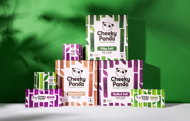 The refreshed identity gives greater prominence to its biggest icons: Colin the Panda and bamboo. Colin now features as a “confident and timeless” brand symbol, paired with a stronger logotype and the clear promise of “sustainable bamboo” to reinforce Cheeky Panda’s eco-credentials.
The new packaging also introduces softer, more natural bamboo patterns that echo the silky feel of the products themselves, with designs flexing across categories. From wraparound effects on tissue boxes that mimic bamboo growing on shelf, to simplified messaging that highlights sustainability without losing the brand’s playful personality, the update aims to ensure Cheeky Panda stands out while staying true to its values.
Julie Chen, Cheeky Panda CEO and Co-founder, commented: “This rebrand is a huge milestone for us. It captures everything our customers already love about Cheeky Panda, while giving us the strength and confidence to take the bamboo revolution to the next level. It’s cheeky, it’s bold, and obsessed with bamboo – exactly what we stand for.”
The company worked with B&B studio on the new packaging design. Shaun Bowen, its Co-Founder and Creative Partner, said: “Our refresh of Cheeky Panda fixes all the problems the original packaging had. Softness, naturalness and a genuine sense of bamboo expertise have all been added in to great effect, resulting in a meaningful evolution that elevates the brand from cheeky challenger to bold bamboo icon.”

