DASH Water has unveiled a new packaging design that reinforces its status as a healthy soft drink.
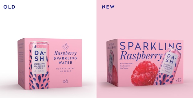 Designed by Horse Studio, the refreshed look dials up DASH’s taste cues while keeping its health and sustainability promises front and centre. Each new pack brings fruit to the forefront, using vibrant, freshly shot imagery,
“We’ve always been known for our health credentials – no sweeteners, no sugar, no calories – but our customers consistently tell us they love DASH for the taste,” said Jack Scott, Co-Founder of DASH Water.
“This new packaging reflects exactly that: the bright, bold colours scream ‘refreshing’, while the fruit-forward design signals ‘natural’ – we’re a soft drink that delivers on flavour, with all the health benefits and none of the junk. By combining our two biggest strengths – taste and health – we’re creating a space in the market that’s completely our own.”
Alongside the new design, DASH is also launching a 12-pack format in retail for the first time, bringing an online bestseller in-store.
“75% of DASH’s online sales come from 12-packs,” added Scott. “So bringing that format in-store was a no-brainer. It responds to strong consumer demand for value, convenience and fridge-filling formats – especially in the warmer months when people are reaching for healthier options to enjoy, share and stock up on. We want to make it as easy as possible for people to make better choices this summer, without compromising on taste.”

