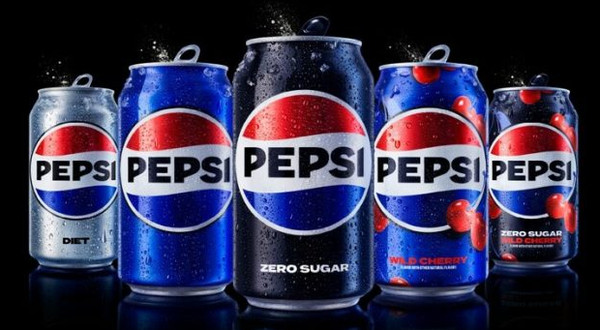
Pepsi has unveiled a new logo and visual identity system, the first update of its iconic branding in 14 years.

The new look will roll out in North America this autumn in time for the brand’s 125th anniversary, and globally in 2024.
The new design features a bold typeface, signature pulse and an updated colour palette, including the colour black, highlighting the brand’s commitment to its Zero Sugar variant.
The revamped look will span across all physical and digital touchpoints, including packaging, fountain and cooler equipment, fleet, fashion and dining.
“At PepsiCo, we design our brands to tell a compelling and holistic story. Pepsi is a shining example of a brand that has consistently reinvented itself over 125 years to remain a part of pop culture and a part of people’s lives,” said Mauro Porcini, SVP and chief design officer of PepsiCo.
“We designed the new brand identity to connect future generations with our brand’s heritage, marrying distinction from our history with contemporary elements to signal our bold vision for what’s to come.”
In the UK, the brand recently reformulated its classic variant to have 57% less sugar.
NAM Implications:
- Modifying an iconic brand’s logo and/or formula…
- …takes courage, real courage.
- Rivals will watch with interest…
- …morphing to concern, if consumers react positively.
- An interesting watch for all…


